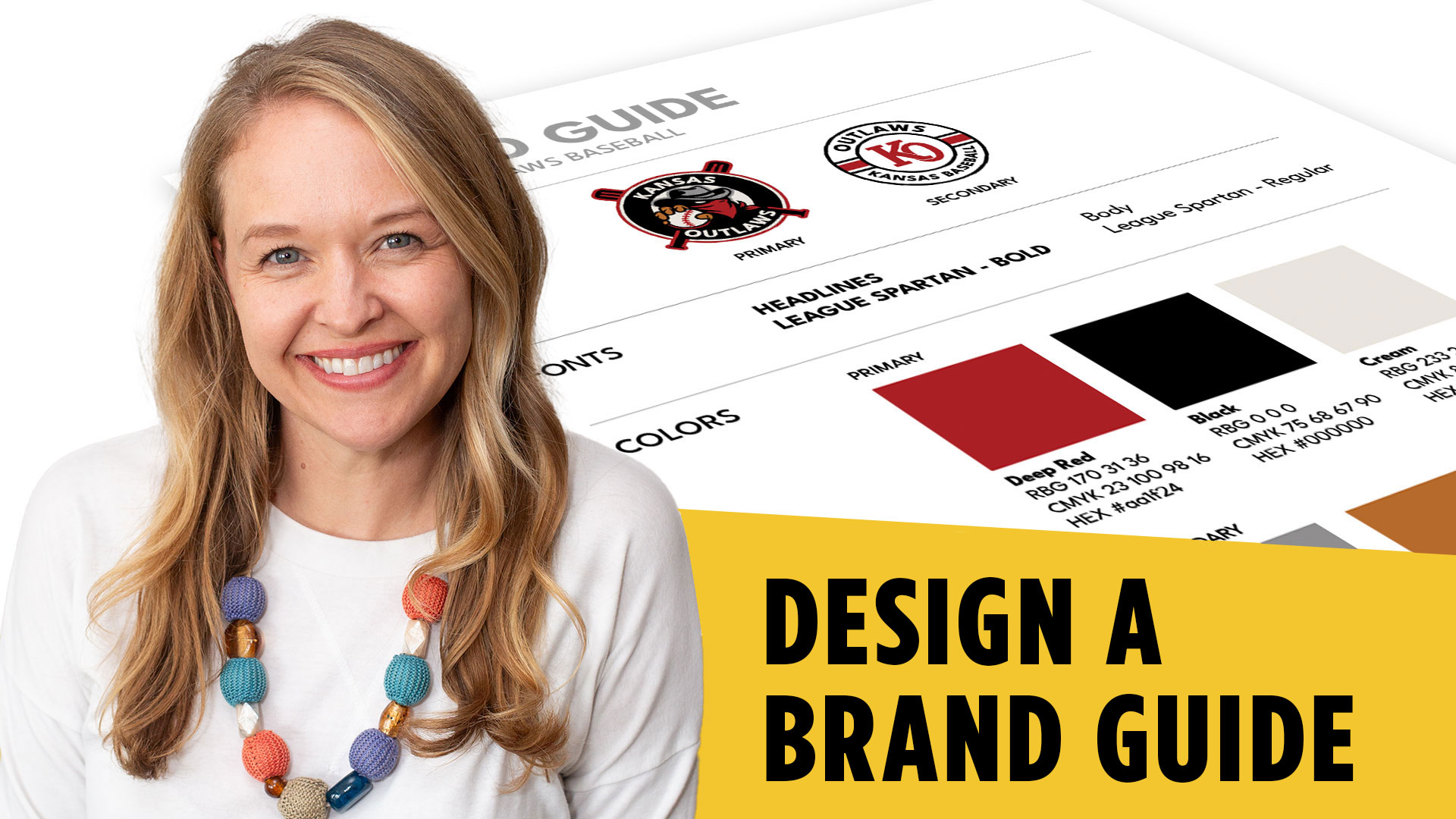
If you’re trying to build real design skills—not just follow random steps—learning how to create a one page brand guide in Adobe Illustrator is one of the most valuable things you can do.
Before we jump in, grab this free brand guide template (Illustrator) — it’ll save you time and help you follow along.
A brand guide is one of those deliverables that instantly makes you feel like a professional designer. It takes your work from “just a logo” to a complete, usable system your client can actually follow.
[YouTube Video Placeholder]
What Is a Brand Guide (And Why It Matters)
A brand guide isn’t about restricting your client—it’s about giving them clarity.
It helps them stay consistent everywhere their brand shows up, whether that’s social media, merchandise, or marketing materials.
Without a guide, clients often misuse logos, choose random fonts, or pick inconsistent colors. That weakens the brand over time.
With a simple one-page guide, you give them structure without overwhelming them.
How to Set Up Your One Page Brand Guide in Adobe Illustrator
The easiest way to start is by working in the same Illustrator file where your logos already exist.
Instead of creating a new document, simply add a new artboard off to the side.
Set your artboard to something close to 8.5 x 11 inches. This keeps it print-friendly and familiar if the client wants a physical copy.
From there, you’re not designing randomly—you’re organizing information.
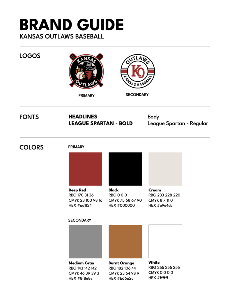
Organizing Logos Clearly
Start by placing your logos into the layout.
Most brands will have at least two:
- A primary logo
- A secondary logo
The primary logo is the main version used most often. The secondary logo is typically for smaller applications like hats or merchandise.
Label them clearly.
Even something as simple as “Primary Logo” and “Secondary Logo” goes a long way in helping clients understand usage.
If you want to go further, you can add short descriptions explaining when to use each—but even a clean layout with labels is enough for a simple guide.
Typography: Keep It Simple and Clear
Next, outline your typography.
You’ll want to show:
- The font used for headlines (bold, all caps)
- The font used for body copy (regular weight, not all caps)
This is where many beginner designers go wrong—they list fonts but don’t explain how to use them.
A better approach is to label them clearly:
- Headlines
- Body Copy
Now the client isn’t guessing—they have direction.
Building a Color System That Makes Sense
This is one of the most important parts of your one page brand guide in Adobe Illustrator.
Start by identifying all the brand colors.
In this case, there are five:
- Red
- Black
- White (or cream)
- Gray
- Tan
Then separate them into:
- Primary colors (used most often)
- Secondary colors (used less frequently)
This small distinction makes a huge difference in how the brand is applied.
How to Add Color Codes (RGB, CMYK, Hex)
Once your colors are placed, you need to define them properly.
Clients (and developers) need exact values—not just visual swatches.
In Illustrator:
- Open the Swatches panel
- Double-click a color
- Copy the RGB, CMYK, and hex values
You can type these manually, but a faster approach is using AI tools to extract them from screenshots.
Just be sure to double-check for accuracy.
A single wrong number can throw off the entire brand.
Layout, Alignment, and Spacing (Where It All Comes Together)
Once all your content is in place, the real design work begins.
Focus on:
- Alignment (everything should feel intentional)
- Spacing (consistent gaps between elements)
- Grouping (keep related items together)
Use Illustrator’s align and distribute tools to space elements evenly.
Also, consider adding simple divider lines between sections like logos, typography, and colors.
These small details make your guide feel polished and professional.
Exporting Your Brand Guide for Clients
The final step is exporting your document.
Go to:
File → Export → Export As → PDF
Make sure you select the correct artboard.
Give it a clear name like:
“ClientName-Brand-Guide.pdf”
Now you have a deliverable you can send to your client—or walk through with them in a meeting.
That walkthrough is important.
A brand guide is only useful if the client understands how to use it.
Why This Skill Matters
Learning how to create a one page brand guide in Adobe Illustrator isn’t just about this one project.
It teaches you:
- Structure
- Communication
- Design thinking
You’re no longer just making things look good—you’re creating systems.
And that’s what separates beginners from real designers.
Final Thoughts
If you’re serious about improving your design skills, this is the kind of project you should practice regularly.
Start simple. Focus on clarity. And always think about how your work will be used in the real world.
If you want to go further, download the free resources below and start building your own brand guides today.
🎁 FREE RESOURCES FOR DESIGNERS
👉 Try Canva Pro free for 30 days → https://partner.canva.com/kOARLL
☕️ Start your 7-day free Adobe Creative Cloud trial → https://adobe.prf.hn/click/camref:1101lKN6K