If you’ve ever printed a design and noticed the colors looked completely different from your screen, you’re not alone. One of the biggest beginner mistakes in print design is working in the wrong color mode. In this tutorial, you’ll learn exactly how to convert RGB to CMYK in Illustrator so your designs are better prepared for professional printing.
Before we jump in, you can download a free trial of Adobe Illustrator if you don’t already have it installed.
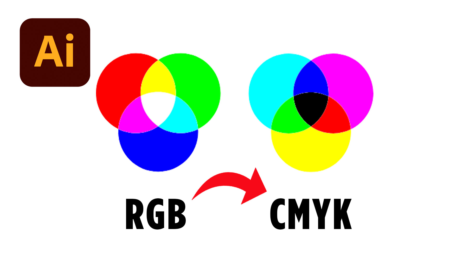
Why RGB and CMYK Look Different
Before you convert anything, it’s important to understand why colors change in the first place.
RGB stands for Red, Green, and Blue. This color mode is designed for screens like phones, laptops, TVs, and monitors. Because screens use light to display color, RGB colors usually appear brighter and more vibrant.
CMYK stands for Cyan, Magenta, Yellow, and Key (Black). This color mode is used for printing. Instead of light, printers use ink. Because of this, some bright RGB colors simply cannot be reproduced exactly in CMYK.
That’s why your printed designs may sometimes look duller than what you originally created on screen.
Understanding this difference is one of the most important steps in becoming a better designer, especially if you plan to create logos, flyers, business cards, or other printed materials.
How to Convert RGB to CMYK in Illustrator
To convert RGB to CMYK in Illustrator, open your document and look at the top tab of your file. If it says RGB, your document is currently using the RGB color mode.
Next, go to:
File → Document Color Mode → CMYK Color
As soon as you click CMYK Color, Illustrator will convert your document.
You’ll probably notice that some colors shift slightly. This is completely normal. Illustrator is adjusting the colors to fit within the CMYK print color range.
This quick setting change is one of the easiest ways to prepare your file for printing.
However, converting the document alone doesn’t always guarantee perfect print colors. You may still need to manually adjust some of your artwork.
Adjusting CMYK Colors After Conversion
After you convert RGB to CMYK in Illustrator, some colors may appear less vibrant than before.
This usually happens with neon colors, bright greens, vivid blues, and highly saturated tones. Since printers cannot reproduce every RGB color perfectly, Illustrator tries to find the closest printable match.
If you want to tweak your colors manually, click on a shape or object in your design and double click the color swatch in the toolbar.
Inside the color settings, you’ll be able to see both RGB and CMYK values.
From here, you can:
- Adjust CMYK sliders manually
- Enter custom CMYK percentages
- Fine-tune brightness and saturation
- Experiment with printable color variations
This step is especially important for branding projects where color consistency matters.
Professional designers often spend extra time adjusting print colors carefully because even small shifts can affect the final result.
The Best Way to Test Print Colors
One of the best tips from this tutorial is simple: test print your work.
Even if your file is technically correct, every printer behaves differently. Paper type, printer settings, ink quality, and finish can all affect how colors appear.
That’s why experienced designers always test their work before printing large batches.
If you’re designing something important like packaging, brochures, posters, or client materials, doing a few small print tests can save you from expensive mistakes later.
It’s also a great way to train your eye and improve your understanding of color management over time.
Common Beginner Mistakes With CMYK
A lot of beginner designers accidentally start their projects in RGB mode without realizing it.
This becomes a problem later when they send files to print shops and discover that the colors changed dramatically.
Another common mistake is relying only on screen previews. Remember, your monitor uses light while printers use ink. They behave very differently.
A smarter workflow is to decide at the beginning of your project whether your design is intended for screen or print.
If it’s meant for print, start in CMYK from the beginning whenever possible.
That small habit can help you avoid unnecessary color corrections later.
Final Thoughts
Learning how to convert RGB to CMYK in Illustrator is one of those foundational design skills that every beginner should understand early on.
It may seem like a small technical detail, but understanding color modes can dramatically improve your print projects and help your designs look more professional.
The more you practice working with RGB and CMYK files, the easier it becomes to predict how your colors will appear in the final printed result.