
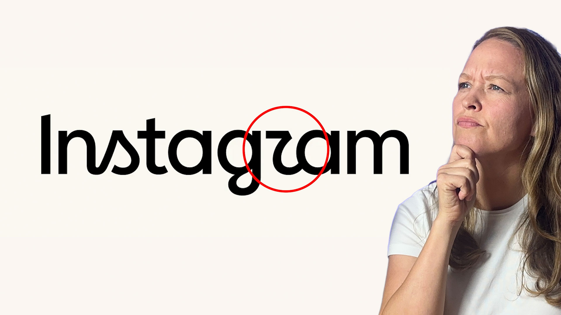
Instagram just changed their logo for the first time in about ten years, and people definitely have opinions.
The biggest complaint? That strange-looking R in the Instagram new logo. Some people think it looks more like a Z than an R. But as a designer, I think that awkward little letter might actually be one of the smartest parts of the redesign.
And if you’re learning logo or brand design yourself, you can grab my free Logo Design Workbook to practice some of these same branding concepts.
Why the Instagram New Logo Looks So Different
Instagram’s previous wordmark had a much more obvious script style.
It felt handwritten, expressive, and human. You could clearly see the influence of traditional lettering throughout the word.
The new wordmark is different.
There are moments where it feels much more like a modern sans serif typeface, which makes sense for a global technology brand. But Instagram didn’t completely abandon the personality of its old logo.
Look closely and you can still find pieces of that script influence.
The connection between the N and S feels fluid and handwritten. The G has a dramatic descending stroke. And then there’s that controversial R.
At first glance, yes—it can look a little like a Z.
But I don’t think that happened by accident.
That “R” Makes More Sense When You Look at the Whole Wordmark
One of the biggest mistakes we make when looking at logos is judging individual letters in isolation.
Logo design doesn’t work that way.
A wordmark is a complete visual system. The letters interact with each other, guide your eye, establish rhythm, and create personality together.
Look at the descender coming from the G in Instagram’s new wordmark.
That stroke has a strong script quality. Your eye naturally follows it upward toward the R, where the shape continues into the next letter.
When you view the letters together instead of separating them, the R starts to make more sense.
It’s not simply an unusual R.
It’s part of the movement of the entire wordmark.
And that brings us to a much bigger branding lesson.
A Redesign Doesn’t Mean Throwing Away Your Brand’s Personality
When companies modernize their branding, there’s often a temptation to simplify everything.
Cleaner typography.
Simpler shapes.
Neutral sans serif fonts.
Minimal visual details.
There’s nothing inherently wrong with that approach. But take it too far and brands can start looking almost interchangeable.
You’ve probably seen redesign comparisons where an expressive logo gets replaced with a perfectly respectable—but completely forgettable—sans serif wordmark.
That’s exactly what Instagram could have done.
They could have created an extremely polished, completely sans serif wordmark and called it finished.
But then Instagram might have looked like every other technology company.
Instead, they kept some of the unusual flourishes and visual history from their previous identity.
That decision gives the Instagram new logo something increasingly valuable: personality.
The Human Touch Matters More Than Ever
There’s another reason I find this redesign interesting.
We’re designing in an era where artificial intelligence can generate images, layouts, logos, and entire visual systems in seconds.
Because of that, work that feels distinctly human becomes even more meaningful.
Those slightly unexpected letterforms in Instagram’s identity create character.
They’re imperfect enough to feel intentional.
And for a platform centered around creativity, photography, storytelling, and personal expression, that human quality makes sense.
The logo shouldn’t feel like it belongs to a banking platform or enterprise software company.
It should feel creative.
Instagram Didn’t Just Redesign a Logo
Another important lesson for aspiring brand designers is that a brand redesign should rarely stop with the logo.
Instagram also expanded its larger identity system.
The updated visual language includes typography that combines modern sans serif characteristics with some of the expressive qualities found in the older identity.
The system also has to work across languages, which adds another layer of complexity to the typography.
Instagram updated its gradient as well, introducing more movement and a stronger sense of light.
That makes sense for a digital brand that exists almost entirely on screens, where motion and interaction are major parts of the experience.
They also developed layout systems and grids that adapt to different sizes and aspect ratios.
That’s what makes this a brand identity redesign, not simply a logo redesign.
The logo is one piece of the system.
Typography, color, layout, motion, imagery, and guidelines all have to work together to create a recognizable brand.
The Real Branding Lesson Behind Instagram’s Redesign
Whether you personally love or hate the new wordmark almost isn’t the most interesting question.
The better question is:
Does the design communicate something intentional about the brand?
I think it does.
Instagram could have removed every unusual detail and created something safer.
Instead, they chose to preserve pieces of their history while moving the brand forward.
That’s a valuable lesson for any designer working on a redesign.
Modernizing a brand doesn’t mean erasing everything that made the brand recognizable in the first place.
Sometimes the strongest redesigns come from figuring out exactly which pieces of the old identity are worth protecting.
And in the case of the Instagram new logo, that weird little R might be doing much more work than people realize.
So what do you think? Do you love the new Instagram wordmark? Hate it? Can you immediately read the R?
Either way, it’s a great example of how much thinking can sit behind what looks like one tiny typographic decision.
If you want to keep building your design skills, download one of my free design resources below or try one of the tools I regularly recommend for creating logos, layouts, and brand identity projects.
🎁 FREE RESOURCES FOR DESIGNERS
- 👉 Try Canva Pro free for 30 days → https://partner.canva.com/kOARLL
- ☕️ Start your 7-day free Adobe Creative Cloud trial → https://adobe.prf.hn/click/camref:1101lKN6K
- 🎨 Shop my favorite design & creator tools → https://amzn.to/4tAYQwN
- Logo Design Workbook — https://cryestudio.systeme.io/logo_design_workbook
- Logo Export Cheat Sheet + Template — https://cryestudio.systeme.io/logoexporttemplate