
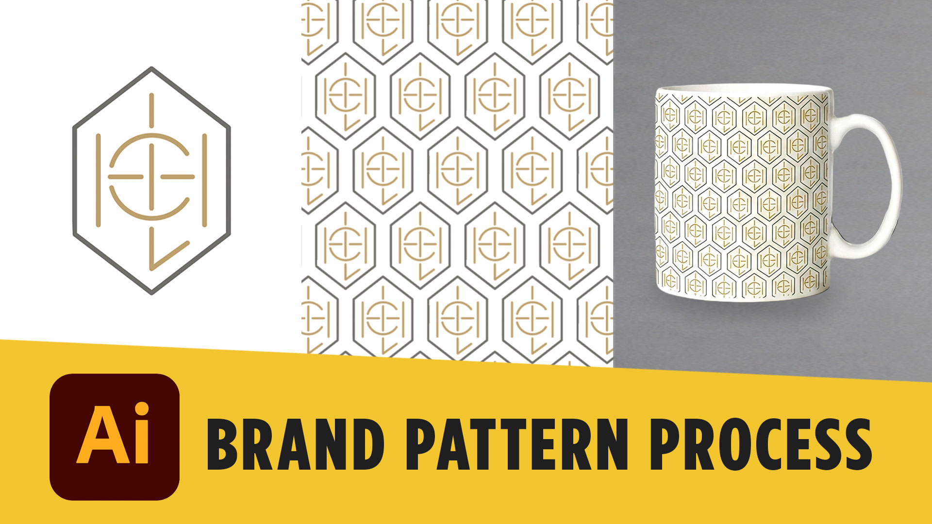
A logo is one part of a brand identity, but a strong visual system goes much further. One of my favorite ways to expand a logo into a complete identity is by turning elements from the logo into a custom brand pattern. If you’re building your own brand identity, you can also grab my free Logo Design Workbook from the resources at the bottom of this post to help guide your process from logo concept to finished brand.
In this tutorial, I’ll show you how to create brand patterns in Adobe Illustrator using an existing logo icon, turn that artwork into a seamless repeating pattern, create alternate color variations, and apply the finished pattern to mockups.
Why Create a Brand Pattern?
A good logo doesn’t have to live by itself. The shapes, icons, typography, colors, and other elements you’ve already developed can become building blocks for a much larger visual identity.
For this project, I’m starting with an existing logo design and pulling out the icon from the top of the logo. Instead of creating something completely new, we’re going to use that recognizable brand element to create our pattern.
This is an important branding principle to understand: you don’t always need more elements—you need more ways to use the elements you already have.
A custom pattern can then be used across packaging, social media graphics, merchandise, websites, printed materials, signage, and other brand touchpoints.
How to Create Brand Patterns in Adobe Illustrator
Start by creating a new square artboard in Illustrator. In my example, I’m using a 200 x 200 pixel artboard, which gives us an easy measurement to work with as we build the repeat.
Copy your logo icon onto the artboard and group all of its elements. Then enlarge the icon and position part of it so that it hangs off one side of your square.
Here’s where understanding the why behind the process becomes important.
Anything that extends beyond one side of your pattern tile needs to continue in exactly the same position on the opposite side. That’s what allows the final artwork to repeat without obvious seams.
Because my artboard is 200 pixels wide, I can use Transform > Move to make a copy of the logo exactly 200 pixels to the right. This ensures the artwork on the left and right sides matches perfectly.
Next, add another copy in the middle and use Illustrator’s Align tools to distribute the spacing evenly.
You’ll repeat essentially the same process vertically. Create additional rows, position the artwork above and below the artboard, and make sure anything extending beyond the top matches the artwork extending beyond the bottom.
At this point, you should have the foundation of your seamless repeat.
Turn Your Artwork Into an Illustrator Pattern Swatch
Once you’re happy with the placement, we need to tell Illustrator exactly where the pattern begins and ends.
First, create a square that’s the exact dimensions of your artboard—in this case, 200 x 200 pixels. Fill it with your desired background color and send it behind the artwork.
Then make a copy of that square using Paste in Place.
Remove both the fill and stroke from the copied square and send it all the way to the back. This transparent square defines the boundaries of your repeating pattern.
Your stacking order should now consist of the transparent square at the back, your background square above it, and your pattern artwork on top.
Now comes the fun part.
Select everything and drag the artwork directly into your Swatches panel. Illustrator will create a new pattern swatch.
Draw a larger rectangle and apply your new swatch as the fill. You should immediately see your artwork repeat across the entire shape.
If the spacing doesn’t look right, don’t worry. Go back to the original artwork, adjust your pattern, and create another swatch until you’re happy with the result.
Create Different Brand Pattern Colorways
Learning how to create brand patterns in Adobe Illustrator also gives you an opportunity to expand the flexibility of your brand system.
For this project, I created a second version using a dark brown brand color for the background with the logo artwork changed to white.
You don’t need to rebuild the entire pattern.
Duplicate your original pattern artwork, change the colors, and drag the updated version into the Swatches panel to create another pattern swatch.
Now you have multiple versions that can be used in different situations while still maintaining a consistent visual identity.
Export Your Pattern for Real-World Applications
Once the pattern is complete, I like to see how it actually works outside Illustrator.
I created a larger 2000 x 2000 pixel artboard, filled it with the completed pattern, and adjusted the scale until the repeat felt appropriate.
When exporting artwork for an actual project, consider where it will be used. For print applications, you may need formats such as PDF and JPEG with the appropriate CMYK setup. For web applications, PNG, JPEG, or SVG may be appropriate depending on the project.
For this demonstration, I exported the pattern as a high-resolution JPEG using RGB because we’re working with digital mockups.
Put Your Brand Pattern on Mockups
Now we can move from designing an isolated graphic to seeing how the identity might actually feel in the real world.
I used mockup imagery and Adobe Firefly to apply the finished brand pattern to several objects. By providing both the mockup image and brand pattern as references, I could prompt Firefly to place the pattern onto the object.
I tested the pattern on a bag, a white coffee mug, and an interior wall.
This is one of my favorite parts of the process because mockups help you evaluate the design in context. A pattern that looks great inside Illustrator may feel completely different when it’s covering a large wall or wrapping around a small piece of merchandise.
It also helps transform your presentation from “here’s a logo” into “here’s what this brand could actually become.”
Once you understand how to create brand patterns in Adobe Illustrator, you can use the same basic process with countless logos, icons, illustrations, shapes, and other brand assets.
The goal isn’t simply to make something repeat. It’s to understand how one strong brand element can become part of a larger, cohesive visual system. Try the process with one of your own logo designs, then experiment with scale, spacing, color, and real-world applications.
If you’d like more help building your design skills, download one of my free design resources below or try one of my recommended creative tools as you work through your next branding project.