If you’ve ever wanted to learn how to turn a rough sketch into a polished logo, this sketch to vector logo tutorial in Adobe Illustrator will walk you through the entire process step-by-step. From hand-drawn lettering to a finished vector logo, you’ll learn how to use the Pen Tool, build consistent shapes, and add depth and color to your designs.
☕️ Start your 7-day free Adobe Creative Cloud trial → https://adobe.prf.hn/click/camref:1101lKN6K
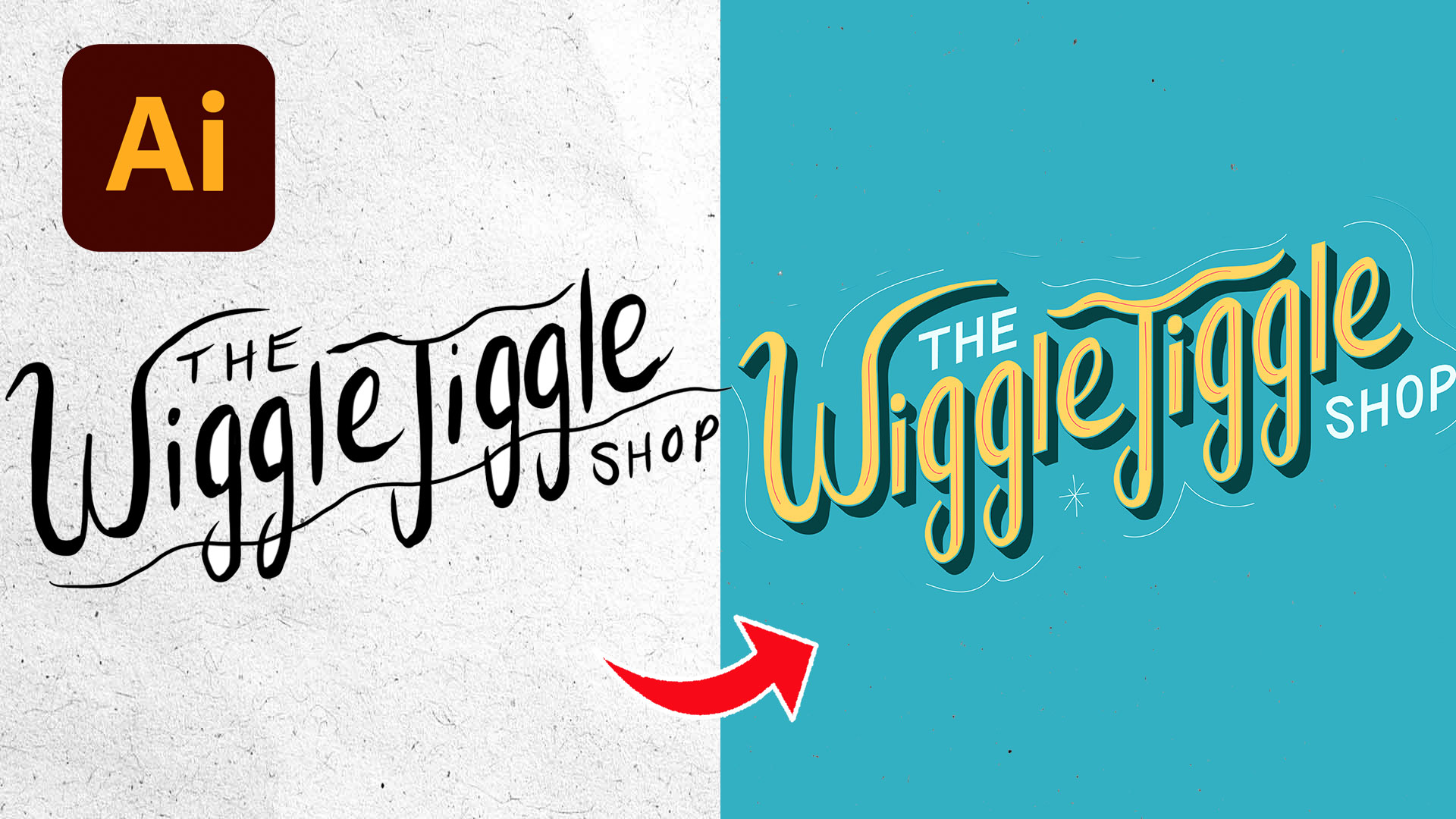
This project actually started as a fun school assignment for my son, but it quickly turned into a great example of how powerful Illustrator can be when transforming hand lettering into vector artwork.
From Hand Sketch to Vector Logo
The logo featured in this tutorial was originally hand drawn on an iPad for a fictional brand called the Wiggle Jiggle Shop.
The playful lettering style immediately felt full of personality, so instead of leaving it as a rough sketch, I decided to bring it into Adobe Illustrator and fully vectorize it.
One of the biggest advantages of vector artwork is flexibility. Once your logo becomes a vector, you can scale it infinitely, recolor it, add effects, and use it for both print and digital projects without losing quality.
That’s why learning how to create a sketch to vector logo tutorial in Adobe Illustrator is such an important skill for beginner designers.
Using the Pen Tool to Vectorize Hand Lettering
After importing the sketch into Illustrator, I placed it onto a locked layer and lowered the opacity so I could trace directly on top of it.
This is one of the easiest ways to cleanly vectorize hand lettering while still preserving the original personality of the sketch.
Then I used the Pen Tool to trace each letter point by point.
Instead of tracing every detail from scratch, I reused shapes throughout the lettering wherever possible.
For example, once I created the width and curve of one letter, I copied similar portions into other letters to maintain consistency across the logo.
This helped the entire design feel much more cohesive and professional.
Why Consistency Matters in Logo Design
One of the biggest lessons in this sketch to vector logo tutorial in Adobe Illustrator is learning how to create consistency throughout your lettering.
When curves, line thicknesses, or spacing feel uneven, logos instantly start to look less polished.
That’s why I constantly zoomed out during the design process to review the logo as a whole.
After tracing everything, I filled the logo with solid black so I could focus purely on shape and spacing before introducing color.
This is a simple trick, but it makes a huge difference.
Viewing your logo in black and white allows you to spot awkward spacing, uneven curves, and readability issues much faster.
Once the black-and-white version looked balanced, I started refining the design further by adjusting small details and smoothing out the lettering.
Adding Color, Shadows, and Depth
Once the structure of the logo was complete, I started experimenting with color combinations.
Originally, I wanted to use bright turquoise, orange, pink, and yellow because the logo had a playful personality.
I duplicated the lettering and used Illustrator’s blend tool to create retro-inspired drop shadows behind the text.
Then I added a large organic background shape around the logo to give it more visual weight and help it stand out.
At first, I tried several color combinations, but eventually the design started feeling too busy.
That’s when I simplified the palette down to turquoise, yellow, and a darker shadow color.
That simplification immediately made the logo stronger.
A lot of good logo design comes down to removing unnecessary details rather than continuously adding more effects.
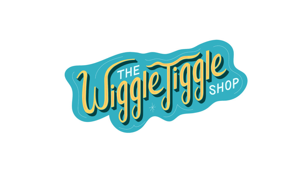
Small Details Make a Big Difference
One of my favorite parts of this process was adding the final finishing touches.
After the logo was mostly complete, I added subtle accent lines and small decorative details around the lettering.
These little additions helped preserve the hand-drawn personality of the original sketch while still making the final vector logo feel polished and intentional.
That balance is really important when vectorizing hand lettering.
You want the final design to feel clean and professional without losing the charm of the original drawing.
Final Thoughts
If you’re learning Adobe Illustrator, practicing hand lettering and vectorization is one of the best ways to improve your skills.
Projects like this teach you how to use the Pen Tool, build consistency, refine shapes, experiment with color, and think more intentionally about logo design.
And the best part is you don’t need perfect drawing skills to start.
Even rough sketches can become strong vector logos when you focus on thoughtful refinement and clear design decisions.
If you enjoyed this sketch to vector logo tutorial in Adobe Illustrator, make sure to check out the free resources below to continue improving your logo design and Illustrator workflow skills.
🎁 FREE RESOURCES FOR DESIGNERS
👉 Try Canva Pro free for 30 days → https://partner.canva.com/kOARLL
☕️ Start your 7-day free Adobe Creative Cloud trial → https://adobe.prf.hn/click/camref:1101lKN6K
🎨 Shop my favorite design & creator tools → https://amzn.to/4tAYQwN
Logo Design Workbook — https://cryestudio.systeme.io/logo_design_workbook
Logo Export Cheat Sheet + Template — https://cryestudio.systeme.io/logoexporttemplate
Favorite Logo Design Books + Tools — https://cryestudio.systeme.io/logo-design-resources
Free Guide: 100 Digital Download Ideas — https://cryestudio.systeme.io/free-resources
Print Prep Checklist for Adobe InDesign — https://cryestudio.systeme.io/free-resources
Project Brief Template — https://cryestudio.systeme.io/free-resources