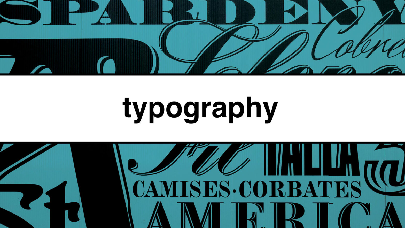
Typography is a crucial aspect of graphic design. It refers to the art and technique of arranging type to make them visually appealing and easily readable. Typography plays a significant role in conveying a message, setting a mood, and creating a memorable visual identity.
In this article we will cover:
Type terminology and rules for designing with type
Type Terminology
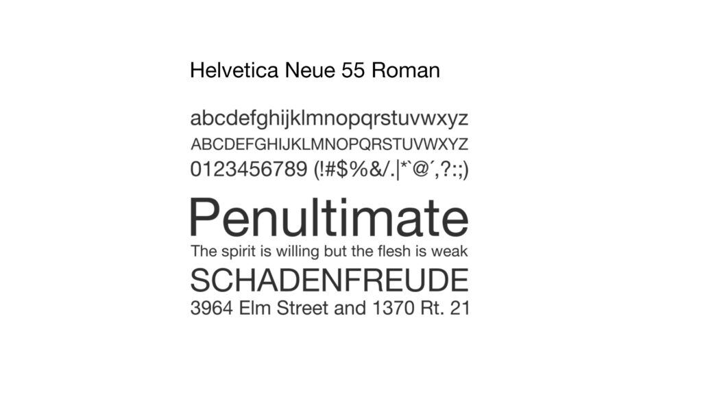
Font
Letters, numbers, punctuation marks and assorted symbols in the same point size in a particular type style.
An example is Helvetica Neue 55 Roman.
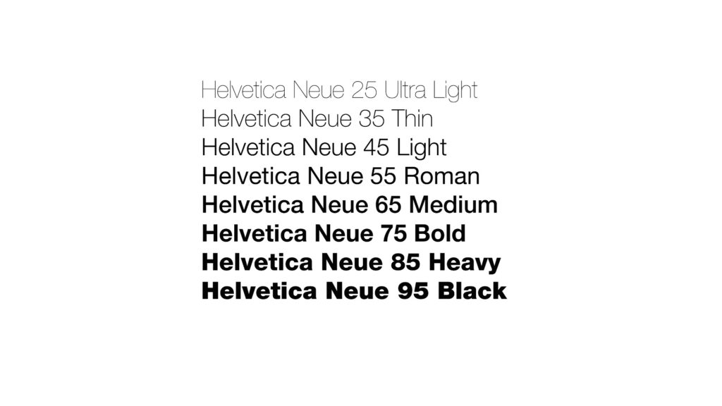
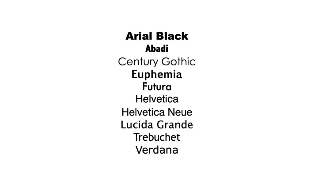
Typeface
A family of letters using the same design, but varying in style, width, weight and texture (bold, italic, condensed, etc.)
In design pieces we often have large type and small type.
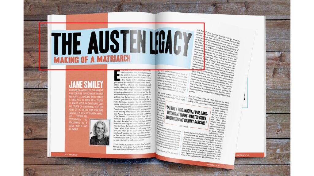
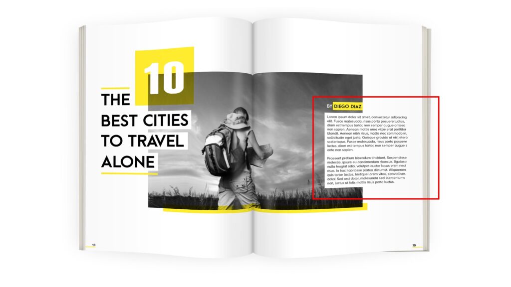
Display text
Display text is large type used for titles, headings, pull quotes, and other eye-catching elements
Body text
Body text is small and is usually the longer form content in a design piece. It should rarely go above 12 point.
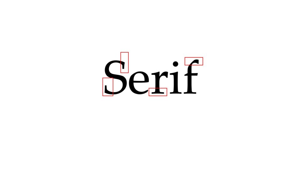
Serifs
Serifs are ornamental flourishes or feet that appear around the extremities of a letter form.
Serifs increase readability as body copy and are commonly used in long form print pieces such as books and magazines.
Serif fonts feel unique, formal, and elegant.
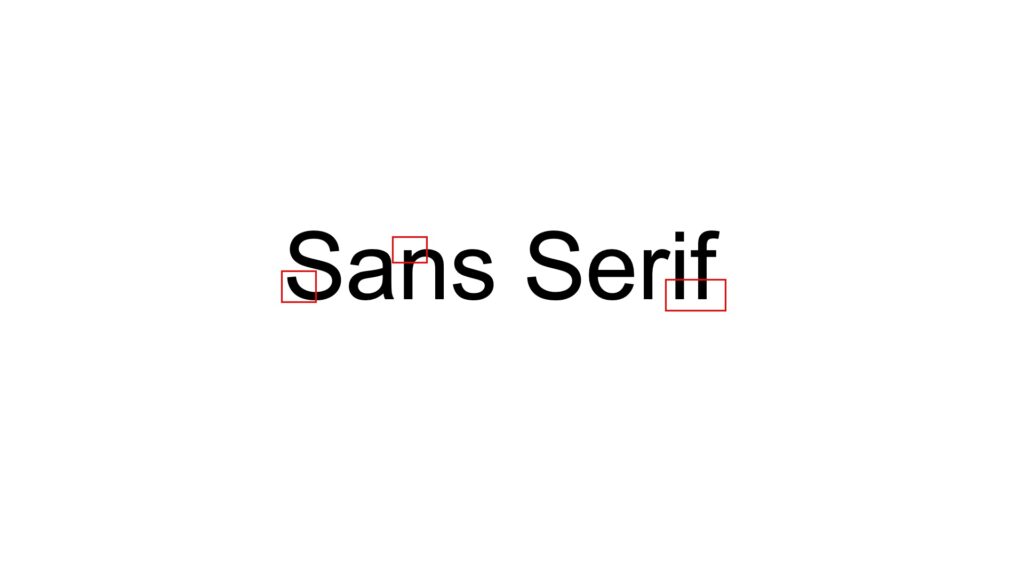
Sans serif
Sans serif typefaces do not have serifs, they have even strokes.
These typefaces have high readability from a distance and are often used as display type.
Sans Serif fonts feel modern, friendly, and minimal.
How to measure type
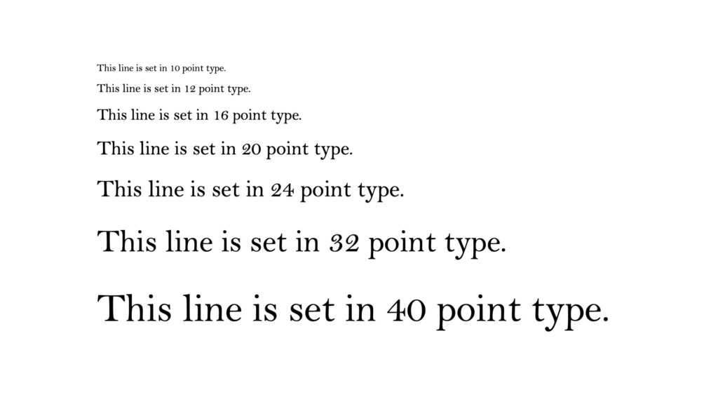
Points
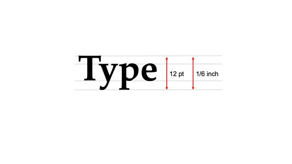
Points are the primary form of measurement in design. Point are also used to specify the size of a typeface.
Points are based on inches. An inch has 72 points so a 12-point font means that the characters are 12/72 inches or 1/6 of an inch tall.
Type, leading, and line weight are each measured with points.
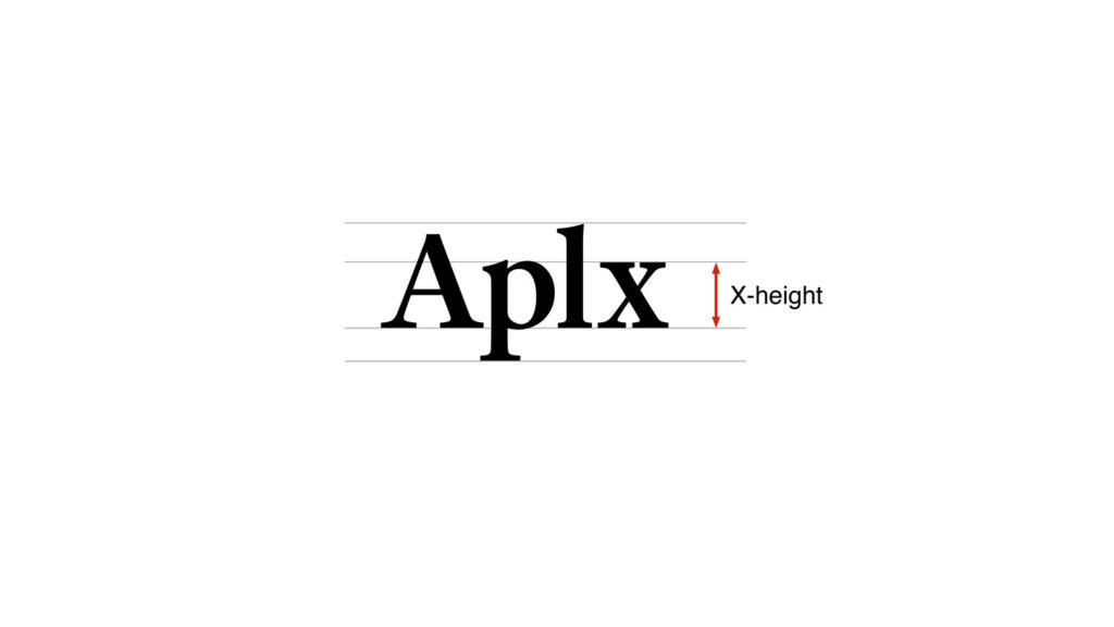
X-height
X-height is the vertical height of a typeface based on its lowercase x.
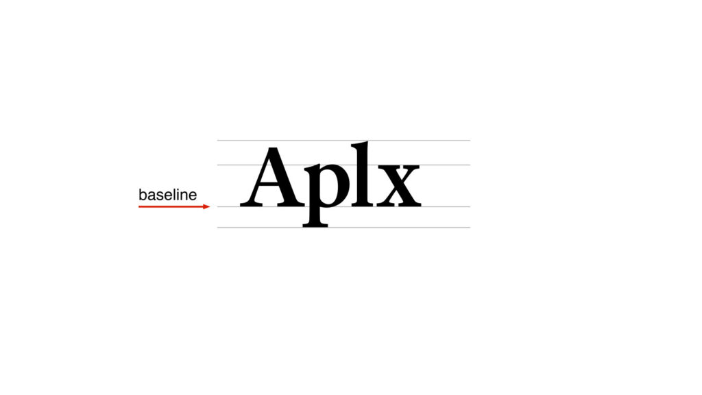
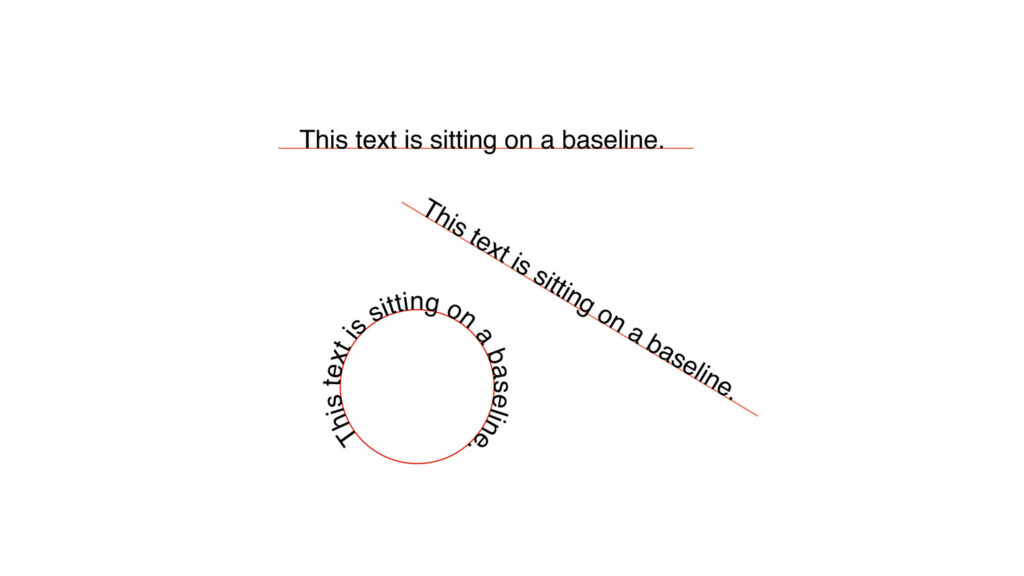
Baseline
The baseline is the imaginary line upon which most letters sit. A baseline can be a straight line, diagonal line or curved line.
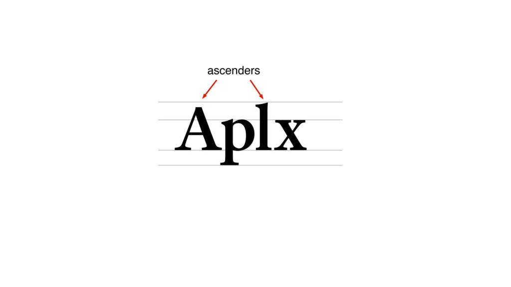
Ascenders
Ascenders are the stems that rise above the X-height.
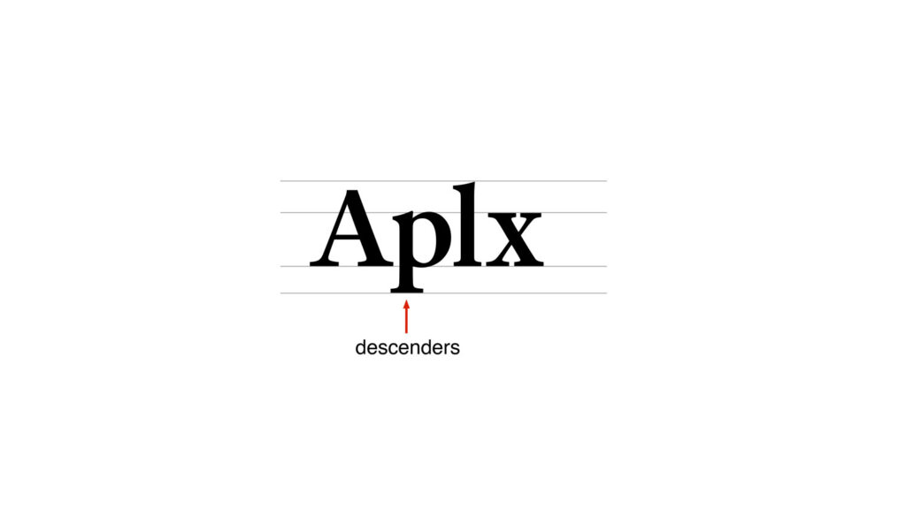
Descenders
Descenders are the stems that drop below the baseline.
Type Spacing
Spacing in typography can affect readability in design, so its very important. Designers adjust the space between letters to change the visual density of a line or block of text.
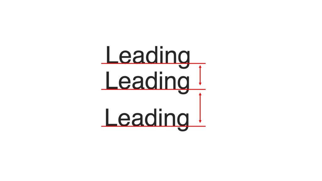
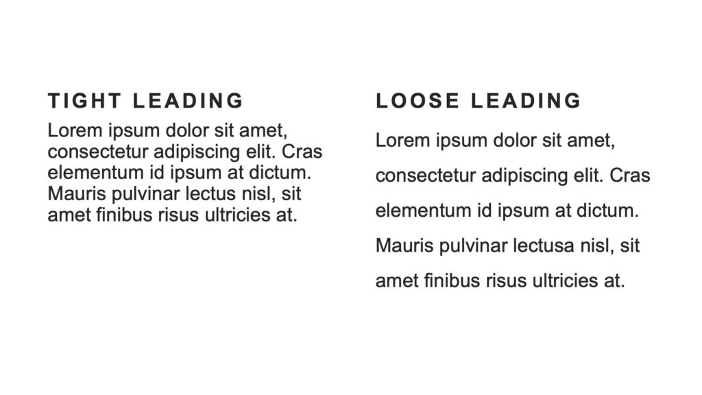
Leading
Leading is the space between lines of text, the vertical space from baseline to baseline. leading can help create balance and visual harmony in your designs as well as improve legibility.
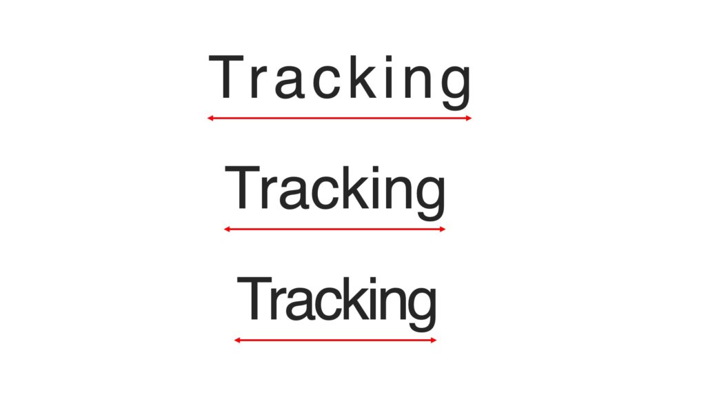
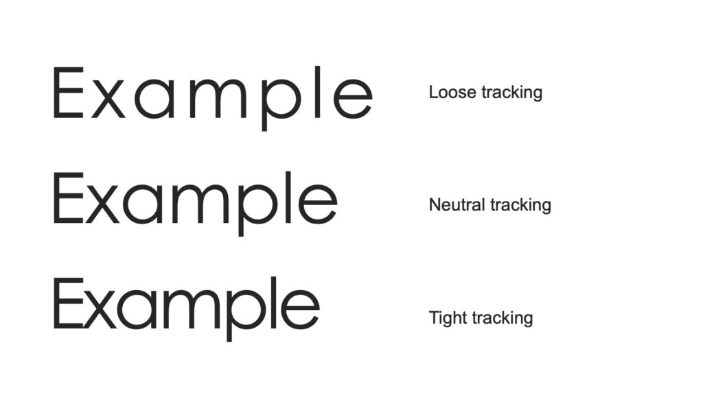
Tracking
Tracking is the space between letters in a word or line of type. Depending on the font, you might need to track type in or out to fix the line breaks in a block or page of text.
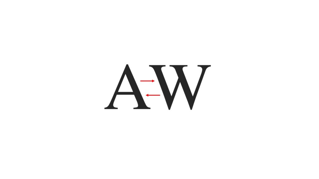
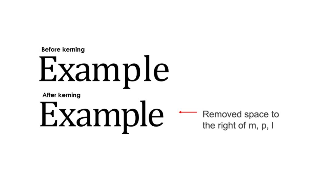
Kerning
Kerning is the space between individual letters. kerning is focused on how type looks — creating readable text that’s visually pleasing.
Designing with type
Designing with typography is the art of arranging a message in a readable and aesthetically pleasing composition.
Always follow basic design principles when designing with typography. Check out the design principles video on my YouTube Channel.
Strategies for selecting type
Font selection
Type should be used as a tool to communicate the actual meaning of words.
Each typeface has a distinct personality. Always select type for its appropriateness to your design, message, and audience.
Arrangement
Thinking about arrangement of type can help someone easily read your design and explain the relationship between elements.
Emphasis
If the viewer takes away one word or one idea from you design, what is it?
Using varying font weights within a design can bring a sense of visual hierarchy.
Clarity and legibility
Can the viewer read the type? Is it clear what I’m trying to convey?
Tone
Is the type Serious, friendly, formal, funny, matter-of-fact, personable, technical?
Personality
Can someone differentiate my design from others? What makes my design unique and different?
Typography rules
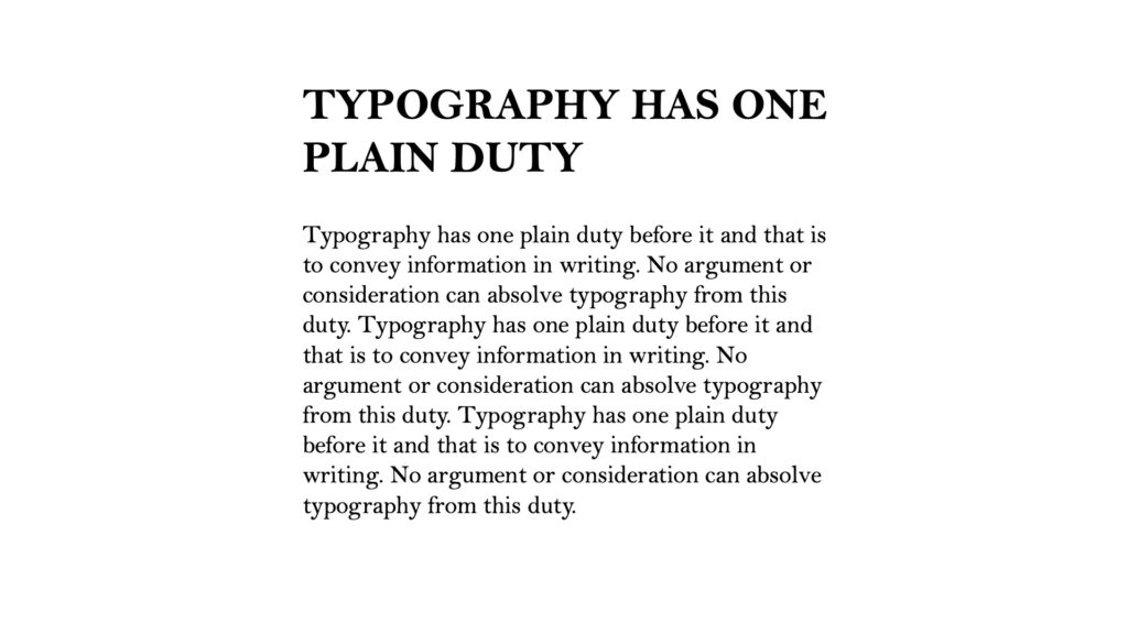
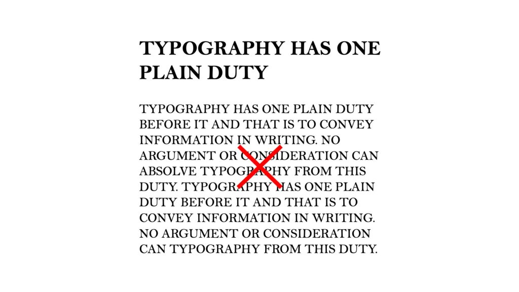
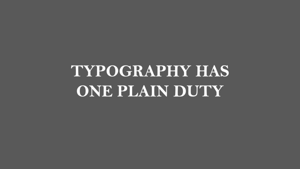
Caps vs lowercase
You can use all caps for display type and headlines.
Body copy usually works best in downstyle, not in all caps.
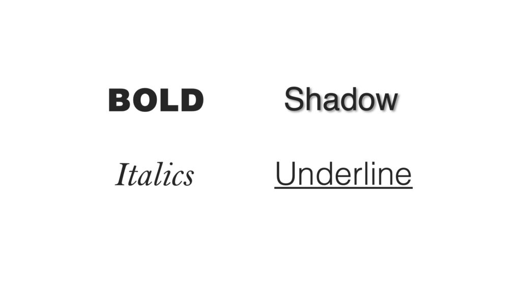
Bold, italics, shadow, underline
Use these sparingly in design and only to emphasize something that needs to be called out.
Reversed text
This is when white type is on a black or colored background.
It needs to be display type to be readable. Don’t reverse body copy.
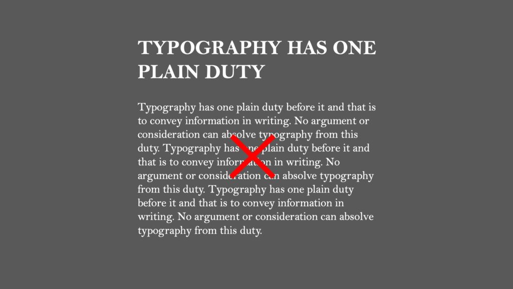
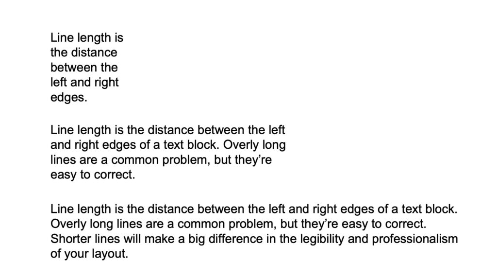
Line length
When we read, we read a line of text, not individual words.
If a line of text is too long, it tires our eyes. Keep line length proportionate to your layout.
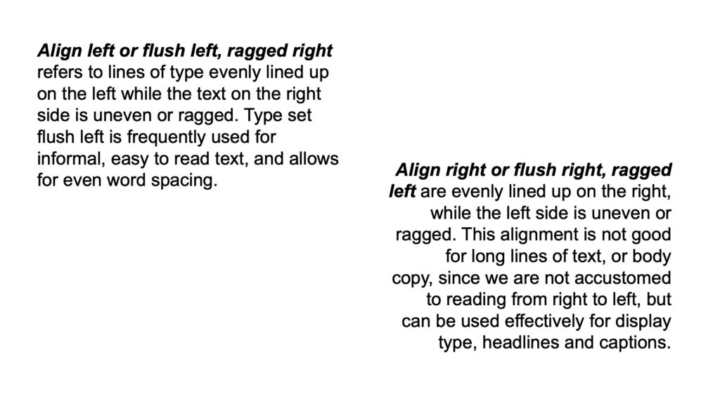
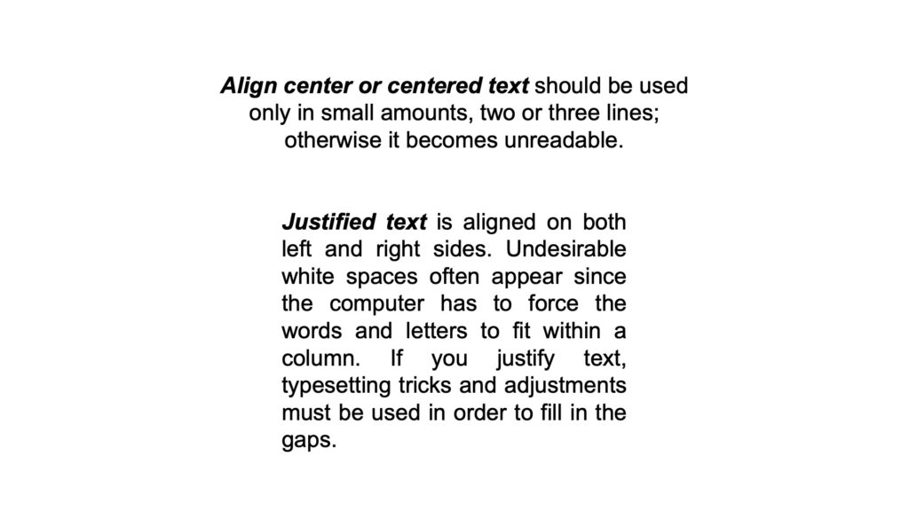
Text alignment
Text can be aligned left, right, center; justified in designs.
Align left is the preferred type of alignment for large bodies of text.
Use centered alignment sparingly.
Justified text can create “rivers” of white space on pages, so used justified text sparingly.
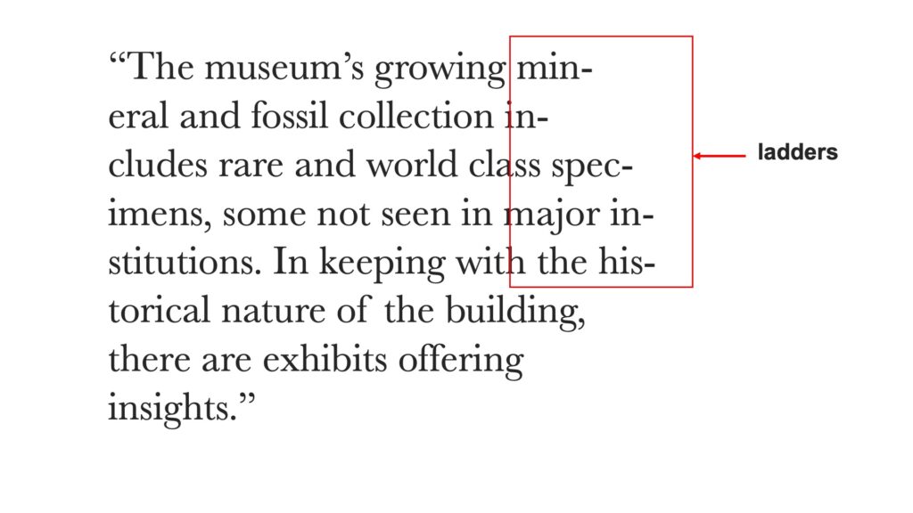
Hyphens
When there are too many hyphens, it can create ladders and be hard to read.
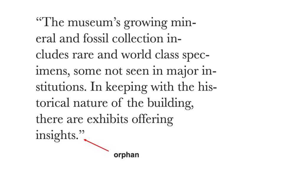
Orphans
Orphans are a single word that may sit alone at the end of a paragraph of text.
In general, you want to remove hyphen and orphans from your designs as much as possible.
By mastering the art of typography, you can effectively communicate your message and create visually engaging designs.
Watch my video about Typography on YouTube.