This post will cover the basics of logo design, how to use symbols, color, typography, and shapes to create a successful logo design. We will also dig into other important considerations when designing and using logos.
What makes a logo work?
Logos must symbolize an organization or business and it’s personality. It needs to convey credibility, recognition, and expertise. It must instill a sense of trust and be memorable. It must be unique.
Then translate all those elements visually into a visual symbol that helps achieve the company’s objectives.
3 types of logo design
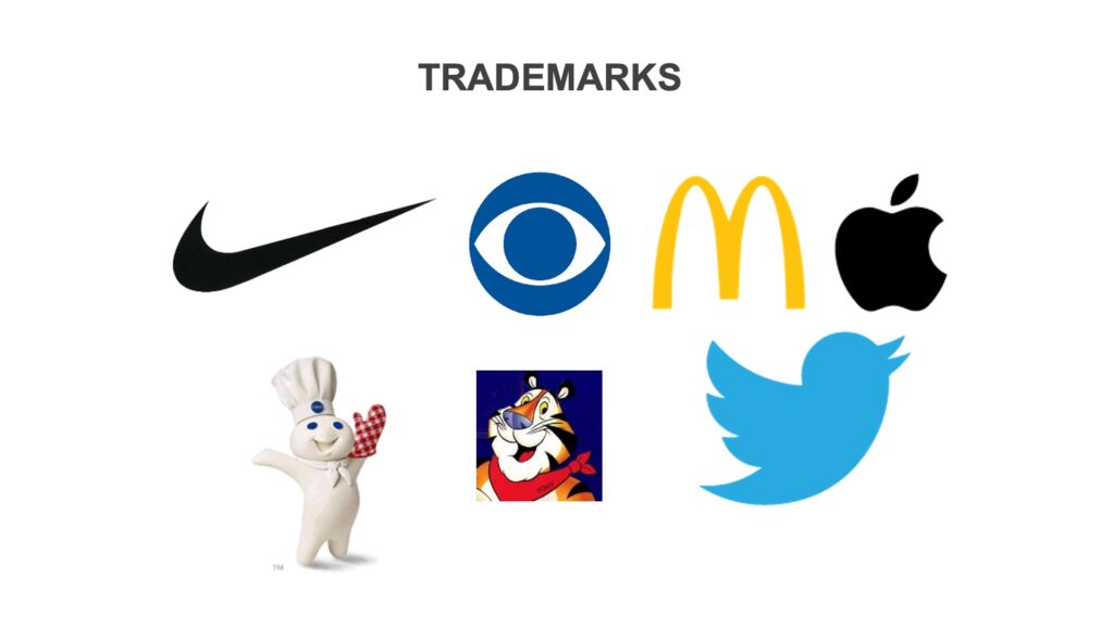
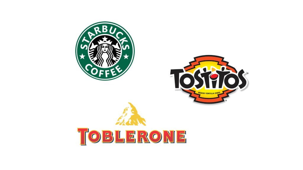
Trademark - A designed name or symbol used by a business or corporation to identify a brand or product.
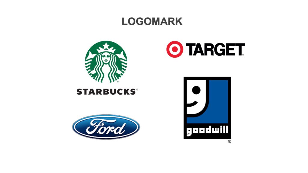
Logomark - Combinations of type and graphics that represent a business, group, project, brand or individual identity.
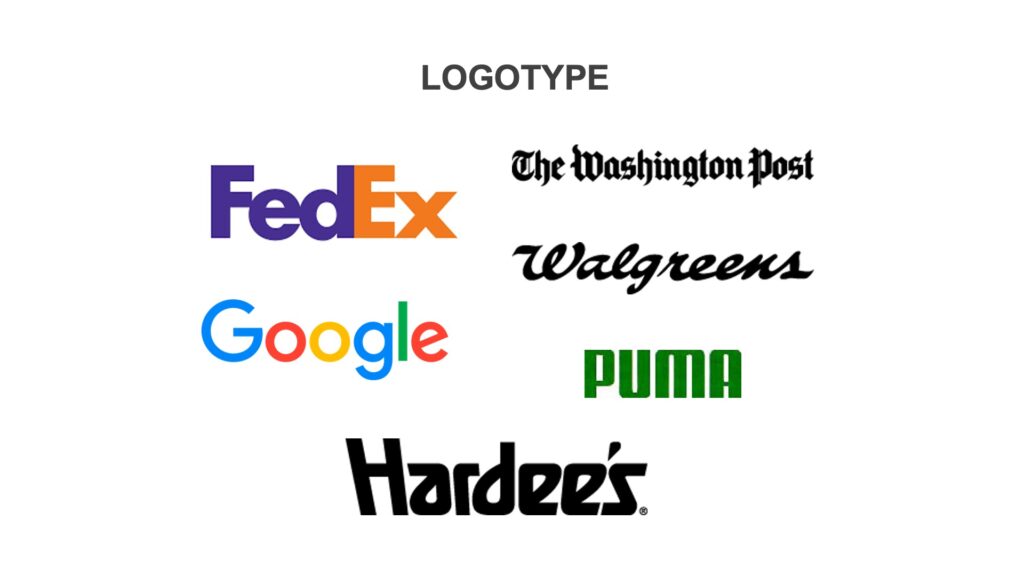
Logotype - A name constructed out of unique typography or lettering and used to represent a business, group, project, brand or individual identity.
Designing logos
When selecting elements of a logo design, don’t just choose what looks good, think about each element of the mark and how it can convey meaning and convey credibility for your brand.
Typography
The style of type can impact how the logo is perceived and how someone feels while looking at a logo.
If you are creating a logo with type and a symbol, keep the typeface simple so the symbol can carry the communication load.
Color
The right color can dramatically increase or decrease the power of a logo.
One to three colors in a logo is often most effective.
Shapes
Is your logo a Circles or square? Does it have Curves or straight lines?
Shapes can affect how the logo can be used, vertical or horizontal format.
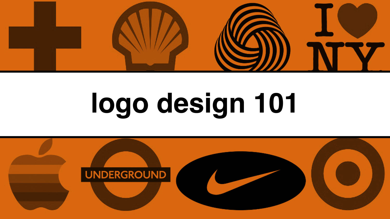
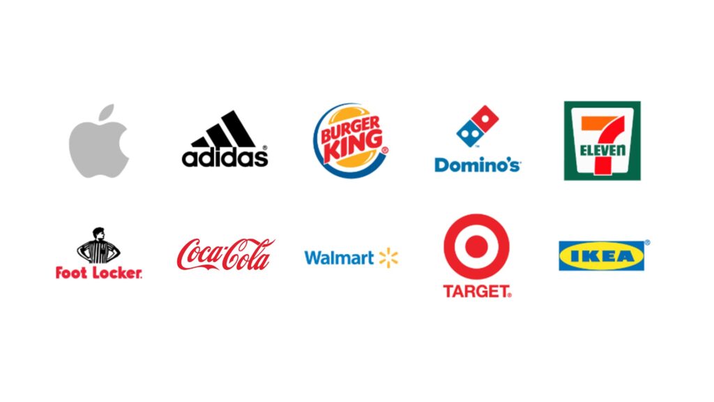
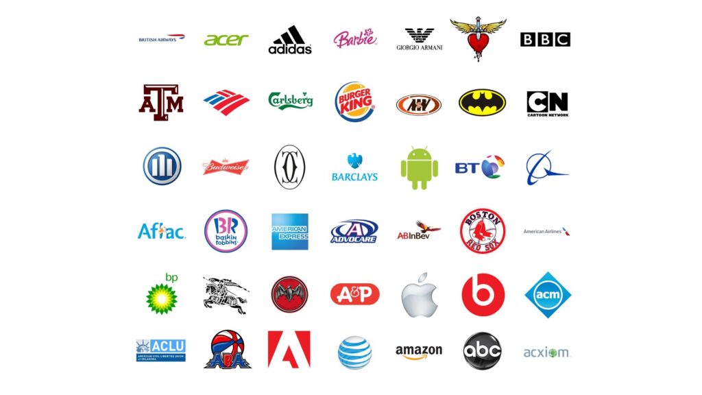
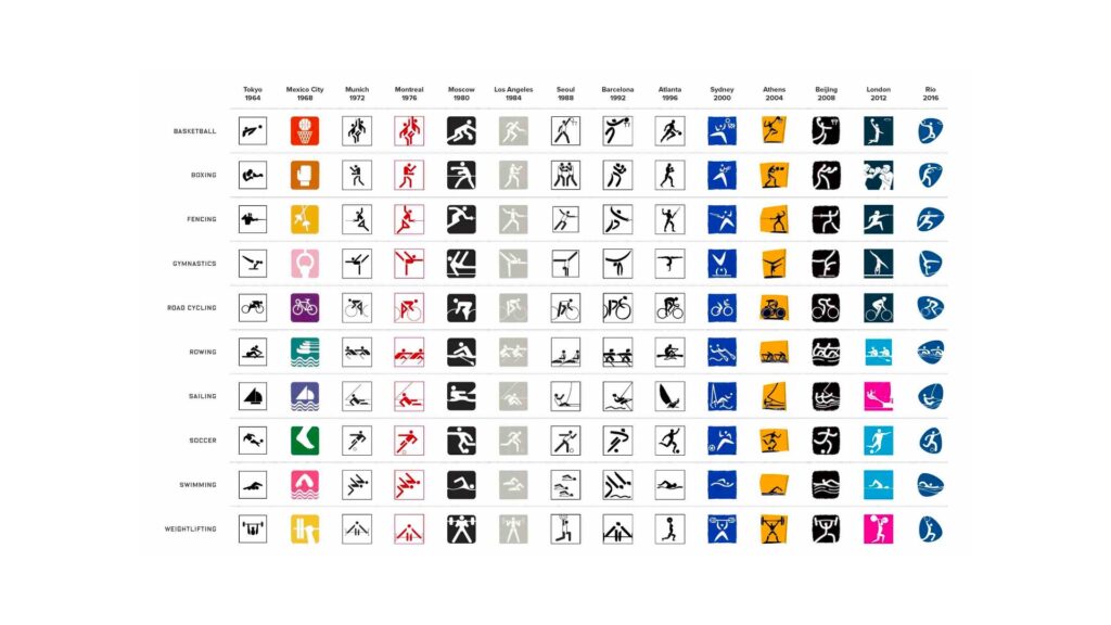
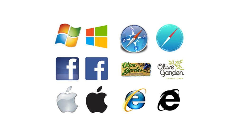
Here is a grid of logos for several companies you probably recognize. Do you start to see similarities between logos in shapes, colors, fonts, styles? There are lots of circles/ovals, several squares, lots of blue/red logos, black and white logos.
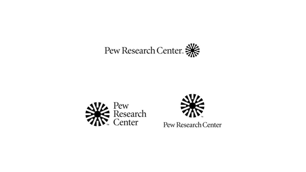
Logo variations
Will the logo work at every size and distance, whether small or large, short-range or long-range?
Is your client capable of making this logo work on various materials, different colors?
How can you design a logo for maximum usability?
Does your logo need various orientation options, for use on different media?
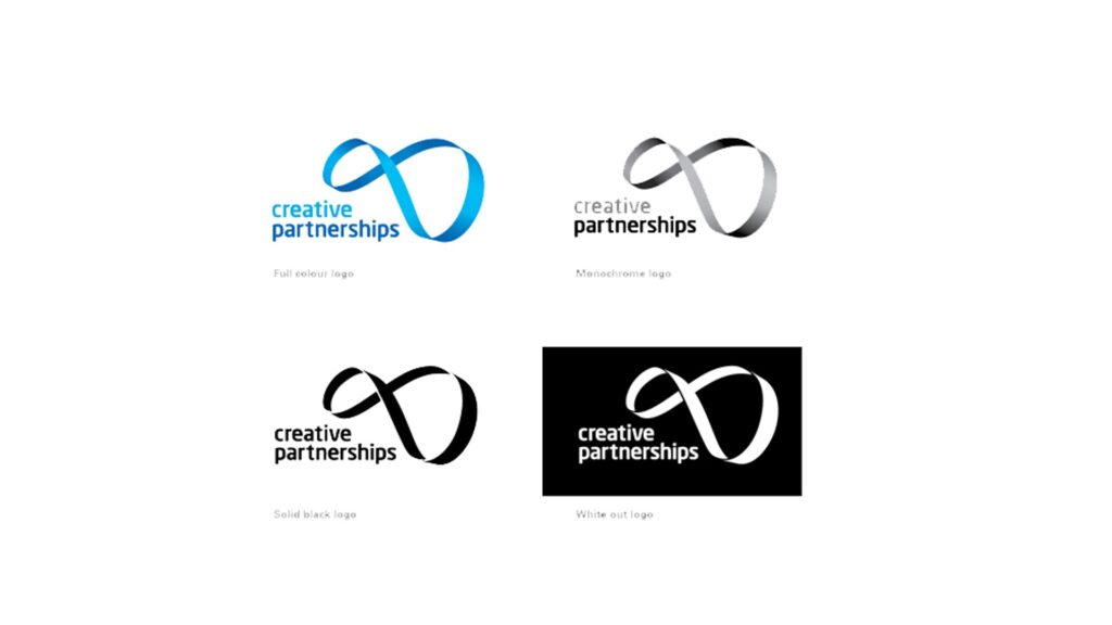
You also want to think about logo usage, can your logo work in black and white? Brands often have a full-color, black, white logo version.
International/cultural considerations
Make sure your logo can be understood across language barriers. A symbol might work best. Make sure that the symbol and colors you choose are acceptable in all cultures.
Logo trends
Avoid creating a logo that is based too heavily on current trends.
Current thinking is that a logo should last for 5-10 years.
Remember, it takes a long time to build consumer recognition.
Legality
Is there a chance that someone will think your logo is actually the other company’s?
You can be sued or asked for a “Cease and desist” of usage of your logo.
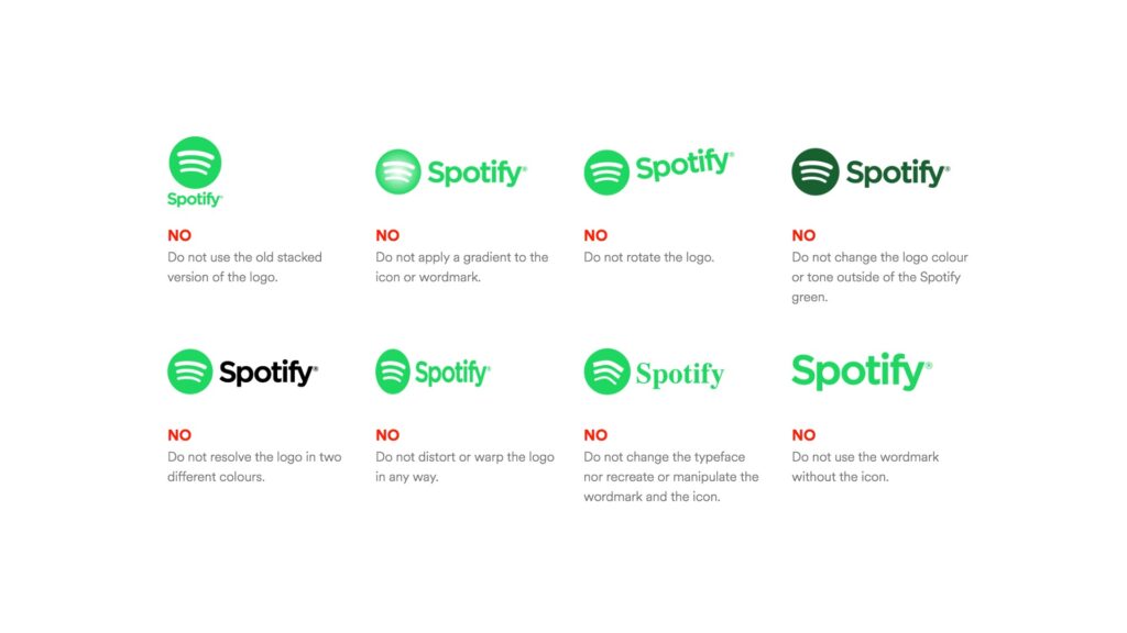
Logo usage mistakes
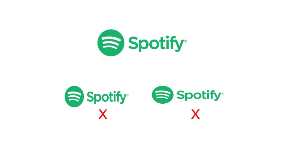
- Never squish or stretch a logo.
- Use logo guidelines when working with brands.
- Never alter a logo that is not your own.
Remember that a logo is just one part of a brand’s identity. It should be consistent with other branding elements like website design, business cards, and marketing materials. A well-designed logo can leave a lasting impression and help a brand stand out from the competition.
Check out my videos about the creative process, graphic design principles, and typography to help you with your logo design project.
Watch the Logo Design 101 video on YouTube: